pt
PF-Logo

Welcome to Pia Frauss' Fonts!

page
down


XiBeronne
Xiparos
XiparosLombard
Xirwena
_a e i o u
DeiGratia
EtBoemieRex
FranciscoLucas
JaneAusten
Home


Love'sLabour
MalaTesta
MitreSquare
SonOfTime
Tagettes
Tycho'sElegy
Tycho'sRecipe
WirWenzlaw
XalTerion
Xenippa font sample
download the Xenippa font here
Buy a Commercial License


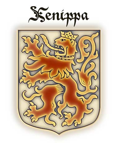
Based on French Bastarda writing and some -- freely handled -- Rotunda capitals, this font has no match in historic documents. It's a first try to combine imitation and imagination.

Just in case the term Rotunda is news to you: this means the style of formal writing used in Italy during those centuries when the rest of Europe was writing Black Letter. They never took to acute angles and steep curves in Italy, neither in architecture -- where they directly moved on from the Romanic style to the Renaissance, leaving the French gothic to the barbarous north -- nor in writing; developing and preferring a style that was clear, and straight, and rounded, and by far better legible than the crammed and distorted Black Letter weaving. It seems however legitimate to tamper with Rotunda capitals, for the original scribes were pretty often given to do it themselves. Lower case letters don't hold much potential for variation, so they took their revenge on the upper case. Invention is mightily at work there, and some writers seem to have deemed it artistic bankruptcy to employ the same shape of an upper case letter twice on the same page, or even in the same chapter. All of which is to say that I didn't go far out of their way by creating some Rotunda capitals of my own.

The name 'Xenippa' is Ancient Greek and means 'having strange (= not one's own) horses'.

Update 2007 has reduced the file size, by redesigning the composite glyps, has added an s that sits on the line, as well as a Yen sign, has corrected the Ldot/ldot, and has moved some of the special characters. These are now
  • an et ligature on the left curly bracket
  • an st ligature on the right curly bracket
  • the new alternate s on the bar and broken bar sign
  • a double long s on the long s sign
  • a long s+t ligature on the 'not equal' sign
The alternate C and E have gone off to the masculine ordinal indicator (fi, 'less than or equal to' sign) and feminine ordinal indicator (fl, 'greater than or equal to' sign); and the alternate G can be found on the 'divide' sign.

The long s, however, still keeps its place on the number sign.

Update 2010 has enlarged the dashes, has the composite glyphs redesigned (especially the dcaron, Lcaron/lcaron, and tcaron), and has created a new m.

top of page


  Home
DeiGratia
_a e i o u
MalaTesta
FranciscoLucas
XiparosLombard
Tycho'sRecipe
Tycho'sElegy
JaneAusten
Xirwena
Love'sLabour
MitreSquare
Tagettes
Xiparos
XalTerion
SonOfTime
WirWenzlaw
XiBeronne
EtBoemieRex


Xenippa font sample

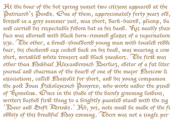
Opening paragraph of the novel The Master And Margarita by Michail A. Bulgakov;
English translation © Richard Pevear and Larissa Volokhonsky.


Conditions of Use Contact Impressum
Please complete the address in your mail form with a-frauss.de
As long as you can put up with an English reply, you may write to me in French, Italian, Portuguese, or Spanish.
German mail will be answered in German.
pd
top of page