Welcome to Pia Frauss' Fonts!
down
| Welcome to Pia Frauss' Fonts! | page down |
XiBeronne is, of course, plain Black Letter Just a bit of information: Gaston Phoebus, Count of Foix (Foix is a pretty town on the French side of the Pyrenees), was a Gascon nobleman, living from 1331 up to 1391. He went occasionally to fight in Prussia, intent on avoiding to take sides in the war raging between French and Englishmen in southern France (or Aquitania, as it was called then), throughout the 14th century. History doesn't portray him as a pleasant character. His Book of the Hunt, however, written during the last years of his life, didn't rest confined to that expensive manuscript. Among the earliest works to be published in print, it turned into a bestseller at once, and continued as such, all over Europe, for centuries to come. He was the most famous authority on his subject, and his instructions were followed so eagerly that by the 19th century, France had been literally emptied of deer. I sincerely hope this piece of news won't keep you from enjoying my font (after all, the illiterate poachers may have had a hand in the disaster, mayn't they?). As usual, you'll find a long s on the number sign.
Update 2010 has redesigned all of the composite glyphs (correcting the dcaron, Lcaron/lcaron, and tcaron), and enlarged the dashes. |
top of page |
| Home DeiGratia SonOfTime Xenippa | FranciscoLucas Tycho'sElegy XiparosLombard Love'sLabour | JaneAusten MitreSquare Xirwena XalTerion | Tagettes Xiparos MalaTesta _a e i o u | WirWenzlaw Tycho'sRecipe EtBoemieRex |
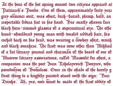
Opening paragraph of the novel The Master And Margarita by Michail A. Bulgakov;
English translation © Richard Pevear and Larissa Volokhonsky.
| Conditions of Use | Contact | Impressum |
| Please complete the address in your mail form with a-frauss.de | ||
| As long as you can put up with an English reply, you may write to me in French, Italian, Portuguese, or Spanish. German mail will be answered in German. | ||
| pd | ||
| top of page | ||