
Welcome to Pia Frauss' Fonts!
down
| Welcome to Pia Frauss' Fonts! | page down |
|
| |||
 |
FranciscoLucas Llana was written at Madrid in 1570, by a man called Francisco Lucas. Employing the Spanish term for a cursive hand, he called it a Bastarda; but technically speaking, it is a humanistic cursive FranciscoLucas Briosa is an alternate and more swashed version of FranciscoLucas Llana, designed after an alphabet of capitals created by the same writing master, and in the same year 1570. Update 2010 has not only enlarged the dashes and redesigned all of the composite glyphs, in both fonts (and corrected the dcaron, Lcaron/lcaron, and tcaron, of course), it has also given FranciscoLucas Llana a new E, W, g, and y. As a consequence, the alternate glyphs, which were formerly the same in both fonts, are now different. In FranciscoLucas Llana, you'll find the the following alternate glyphs:
Update 2007 had reduced the files' size, by redesigning the composite glyphs, and corrected some flaws -- above all, an error concerning the lcedilla sign. |
top of page |
| Home Xenippa XalTerion MalaTesta | DeiGratia XiparosLombard Tycho'sRecipe Tycho'sElegy | JaneAusten Xirwena _a e i o u SonOfTime | Tagettes Xiparos Love'sLabour MitreSquare | WirWenzlaw XiBeronne EtBoemieRex |
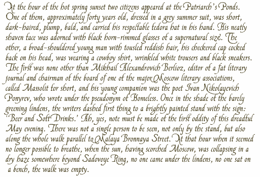
Opening paragraph of the novel The Master And Margarita by Michail A. Bulgakov;
English translation © Richard Pevear and Larissa Volokhonsky.
| Conditions of Use | Contact | Impressum |
| Please complete the address in your mail form with a-frauss.de | ||
| As long as you can put up with an English reply, you may write to me in French, Italian, Portuguese, or Spanish. German mail will be answered in German. | ||
| pd | ||
| top of page | ||