Welcome to Pia Frauss' Fonts!
down
| Welcome to Pia Frauss' Fonts! | page down |
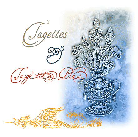
These fonts are dedicated to the lovers of swashes, and I shall feel vastly flattered if you use them to write your wedding invitations Tagettes & TagettesPlus are the type of Italian chancery cursive of the 16th and 17th century that is mostly called Cancellaresca. They were developped out of a page of samples created by the French writing master Louis Barbedor around 1650 (unfortunately, the man's name is already taken by another font, so I had to invent a fancy name). Monsieur Barbedor provided such a variety of ps and fs and gs etc. that for a while I got quite lost in that jungle. At long last, I realized, moreover, that swashing too many of the lower case glyphs would make the font look crammed. So, I finally settled on the swashed g Both fonts are matching As usual, there is no number sign in this font, and you'll find a long s in its place. Despite the alternate font, there are still extras in the main font, e.g.
Update 2007 has somewhat altered the TagettesPlus font, adding a swash to the c, s and v, changing the e and t, and redistributing some of the keys. Here's the actual list:
Update 2010 has not changed the TagettesPlus font. However, for the main font, it has not only enlarged the dashes, and corrected the dcaron, Lcaron/lcaron, and tcaron, it has also redesigned the composite glyphs, and has done this two times over. There is now a difference between the UNICODE version on this page, and the ASCII version you'll find in the collection on the home page. The UNICODE version has been provided with every accented Western character I found in Arial, including U/uhorn, Ohorn/ohorn, as well as their derivatives, and the Schwa/schwa. On top of that, fhe accented glyphs have been treated with more consideration than in the ASCII font. In the ASCII version, the capitals have mostly been downsized to make room for the accents above, whereas in the UNICODE font, the gap between the lines has been enlarged, to keep the capitals as intact as possible. If you need to use accented characters, the Unicode version should be your choice. |
top of page |
| Home Xenippa XalTerion SonOfTime | FranciscoLucas XiparosLombard EtBoemieRex MitreSquare | JaneAusten Xirwena Love'sLabour MalaTesta | WirWenzlaw XiBeronne Tycho'sElegy Tycho'sRecipe | DeiGratia Xiparos _a e i o u |
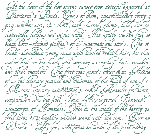
Opening paragraph of the novel The Master And Margarita by Michail A. Bulgakov;
English translation © Richard Pevear and Larissa Volokhonsky.
| Conditions of Use | Contact | Impressum |
| Please complete the address in your mail form with a-frauss.de | ||
| As long as you can put up with an English reply, you may write to me in French, Italian, Portuguese, or Spanish. German mail will be answered in German. | ||
| pd | ||
| top of page | ||