Welcome to Pia Frauss' Fonts!
down
| Welcome to Pia Frauss' Fonts! | page down |
| Please don't ask me why there are two German emperors called Friedrich (= Frederick) III: I might be tempted to explain. By a funny coincidence, they were those who reigned shortest and longest: the Hohenzollern one for just 99 days, in 1888, and the other Alas, there is a follow-up to the story. The worthy citizens of Vienna, in 1460, seem not to have thought much of this imperial gift. For, when duke Albrecht returned in 1462, freshly supplied, they not only opened their gates to him, but joined his forces, besieging the emperor in his residence, and going as far as to fire their canons at the appartement of his wife (who was, by all accounts, a delicate Portuguese princess). The best explanation for this is that Frederick never owned much money, and refused to live beyond his means, whereas his brother was nicknamed 'The Spendthrift' Why is my font called _a e i o u? Well, how could a font based on one of Frederick III's charters be called anything else? Posterity has decided that Frederick has presented them with a riddle. He kept a notebook, written 'with my own hand', and one of the first things he entered, were the five vowels, underlining them with a stroke, and declaring, 'At whichever edifice, or on whichever silver vessel or clerical ornate, or other trinkets AEIOU, the stroke and the five letters, appear, that has been mine, Frederick the Younger's, or I have got it built or made'. Nobody knows what he wanted these vowels to mean. It's a good guess to assume he didn't know it himself. However, since they were always considered to be an abbreviation, explications abound to this day. None of them are compelling. The only thing that's for sure, is that Frederick can never even have dreamt of the silly Austriæ est imperare omni universo (I hereby refuse to translate this nonsense) interpretation, which was later added in a different hand; for Frederick's notebook got stolen one day, and resurfaced after two centuries, showing a lot of alterations. Twenty-one years of age when he conceived his AEIOU idea, Frederick was then an obscure little duke of Styria who had until recently been shamelessly robbed by his guardian uncle (the older Frederick, aptly nicknamed 'Of The Empty Pocket'), with next to no hope of becoming emperor one day As usual, the number sign in this font has been replaced with a long s. The other special characters are:
Update 2010 has redesigned all of the composite glyphs (correcting the dcaron, Lcaron/lcaron, and tcaron), and enlarged the dashes. |
top of page |
| Home Xenippa XalTerion MalaTesta | FranciscoLucas XiparosLombard EtBoemieRex MitreSquare | JaneAusten Xirwena Love'sLabour SonOfTime | WirWenzlaw XiBeronne Tycho'sRecipe Tycho'sElegy | Tagettes DeiGratia Xiparos |
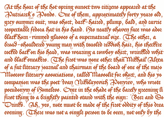
Opening paragraph of the novel The Master And Margarita by Michail A. Bulgakov;
English translation © Richard Pevear and Larissa Volokhonsky.
| Conditions of Use | Contact | Impressum |
| Please complete the address in your mail form with a-frauss.de | ||
| As long as you can put up with an English reply, you may write to me in French, Italian, Portuguese, or Spanish. German mail will be answered in German. | ||
| pd | ||
| top of page | ||