pt
PF-Logo

Welcome to Pia Frauss' Fonts!

page
down


WirWenzlaw
XalTerion
Xenippa
XiBeronne
Xiparos
XiparosLombard
Xirwena
_a e i o u
DeiGratia
Home


EtBoemieRex
FranciscoLucas
JaneAusten
Love'sLabour
MalaTesta
MitreSquare
SonOfTime
Tagettes
Tycho'sElegy
Tycho'sRecipe font sample
download the Tycho'sRecipe font here
Buy a Commercial License


As far as my understanding of the Danish language goes -- which, I'm sorry to say, equals two timid steps into a huge total darkness --, I'm lead to believe that I may be indebted for this font to Christian IV's court chemist Peter Payngk, who lived from about 1575 to about 1645. It seems he used to collect recipes for medical preparations, copying them into some large volume(s) of his own. One of those recipes, on show among the digital exhibits of the Royal Library of Denmark (= Det Kongelige Bibliotek), is thought to have been authored by the great astronomer Tycho Brahe. Called Elixyr Tychonis, it is listed as 'Description of a medecine (...) against the Plague, and all Morbos Epidemicos', offered to the queen of Denmark by Lady Sophie Brahe, sister of the astronomer (no date is mentionned).

The person who copied Tycho's recipe (Peter Payngk, or maybe an assistant of his), used Antiqua writing when naming the preparation's ingredients, and a contemporary current hand, when detailing the instructions. My font is mostly based on the Antiqua parts of the manuscript.

A major Update has been going on, for the 2010 version. The l and t have been reworked, to sit on the line now. Three alternate characters -- the g, y, and p -- have changed places with the regular ones, and I've designed a new, modern-looking K (the original one was really a bit odd). Of course, like in all the other fonts, the composite glyphs have been redesigned, and the dashes have become longer.

The list of alternate characters has changed in 2010. These are now:
  • an alternate d on the 'less' sign
  • an alternate -- i.e. the formerly regular -- g on the 'more' sign
  • an alternate z on the right bracket (sitting on the line, as opposed to the regular one)
  • an alternate l on the left bracket
  • an alternate -- i.e. the formerly regular -- y on the right curly bracket
  • an alternate -- i.e. the formerly regular -- p on the left curly bracket
  • an alternate r on the 'bar' and 'broken bar' sign
  • a double long s on the long s sign
  • the double f ligature, and the original K on the fi and fl. In case those aren't reachable on your computer, please try the masculine and feminine ordinal indicators, or the 'less-than or equal to' and the 'greater than or equal to' signs.
There is no number sign in this font. In its place, you'll find a long s.

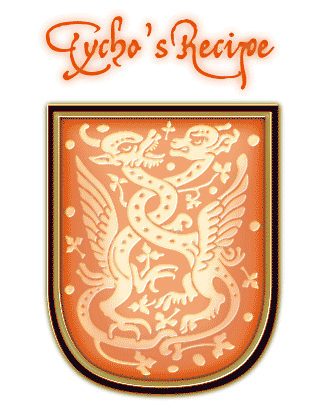
The pair of winged beasts on the micro sign was inspired by a detail from a very elaborate Lombardic initial.

top of page


  Home
DeiGratia
SonOfTime
Xenippa
FranciscoLucas
Tycho'sElegy
XiparosLombard
Love'sLabour
JaneAusten
MitreSquare
Xirwena
XalTerion
Tagettes
Xiparos
MalaTesta
_a e i o u
WirWenzlaw
XiBeronne
EtBoemieRex


Opening paragraph of the novel "The Master And Margarita" by Michail A. Bulgakov; English translation © Richard Pevear and Larissa Volokhonsky

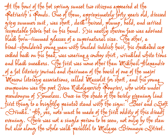
Opening paragraph of the novel The Master And Margarita by Michail A. Bulgakov;
English translation © Richard Pevear and Larissa Volokhonsky.


Conditions of Use Contact Impressum
Please complete the address in your mail form with frauss.de
As long as you can put up with an English reply, you may write to me in French, Italian, Portuguese, or Spanish.
German mail will be answered in German.
pd
top of page