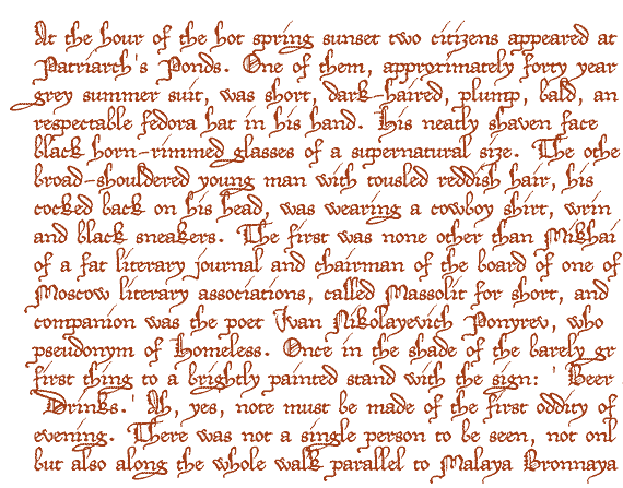
This font is rather closely based on a charter issued in 1275 by Rudolf of Hapsburg (the first of his house to make it on the German throne). Said charter is remarkable for two fine qualities: firstly, for containing, thanks to a long list of witnesses, a nearly complete set of upper case characters in the same style as the text -- which is a far from common occurrence in charters of that epoch --; and, secondly, for the scribe's ability to create a charming impression of harmony by producing a thorough mess. No letter ever hits the line, and the distance by which it fails is never the same as that of its neighbours; the middle zone characters are considerably varying in height, even in the same word, ms are hobbling around on one long and two short legs (or vice versa), upper as well as lower case letters are narrowing or broadening at random, blotched and shivering strokes seem to be the chief styling feature ... and yet the whole is a pleasure to look at. As a consequence, inheriting a lot of the charter's qualities, this font will look best in longer texts. I'm sorry to confess that I'm unable to imagine what such texts might be.
As for the type of writing, I'm quite at a loss. Created at a time when book writing was in the early stages of Black Letter, this charter's hand contains elements of formal as well as cursive writing, ending up with being neither the one nor the other. To simply call it a documentary hand doesn't help either, for even as such it sticks out like a sore thumb among the -- clearly more cursive -- charters of its epoch. Altogether, the document looks a bit too sumptuous for a charter issued by Rudolf of Hapsburg, who was renowned for being extremely parsimonious. Whole legends were told about his mending his gowns and helmets himself (it has even been said that when he felt he was going to die, he rode in a haste to Speyer, where he wanted to be buried, to save posterity the expense of bringing his body thither), and all the other charters of his chancery that I know of bear that character out, being chiefly notable for their minuscule writing. There certainly never was neither ink nor parchment squandered; whereas, in this document, the text, though lavishly adorned with ink-swallowing Lombardic capitals, hardly covers half of the available space. -- Let's not get too suspicious. For sure, this charter was granting privileges to a monastery, and abbeys have been known to push their claims by means of forging charters; yet it is perfectly thinkable that the beneficiaries wrote it at home and brought it along to be signed, sealed and ratified, which would very well fit the pattern. And let's further consider the possibility of some young clerk trying his hand for the first time, and being fired immediately afterwards, for waste of his employer's resources... Anyhow, even as a forgery, this would still be a very old as well as a very beautiful document. Therefore, I shall hereby invent the term of proto-Bastarda, and leave the rest to palæography.
There is no number sign in this font. In its place, you'll find a long s. Equally, you'll find extras in other places:
- a double f on the left bracket
- a double p on the right bracket
- a double l on the left curly bracket
- a double g on the right curly bracket
- a double long s on the long s sign
- the charter's most eye-catching abbreviation sign on the ASCII tilde (it should be used like an accent)
- a separator of sentences on the bar sign
- as well as a long s + t ligature, and the original N on the fi and fl. In case those aren't reachable on your computer, please try the masculine and feminine ordinal indicators, or the 'less-than or equal to' and the 'greater than or equal to' signs.
As to the abbreviation sign's meaning, I'm not sure. It seems to say that one or more characters are
missing form the word below it -- sometimes this is an i, sometimes an n, and sometimes the whole
ending of a noun.
The sentence separator, used twice in the document, consists of a feathered horizontal line at uppercase
height. In this font, it contains the preceding sentence's period, too. It has even been included in the font's
kerning.
And the original N ... yes, yes, I replaced it by one of my own making. Go look at it on the fl sign to understand why.
Update 2010 has redesigned all of the composite glyphs (correcting the dcaron, Lcaron/lcaron, and tcaron), and enlarged the dashes. |


