Welcome to Pia Frauss' Fonts!
down
| Welcome to Pia Frauss' Fonts! | page down |
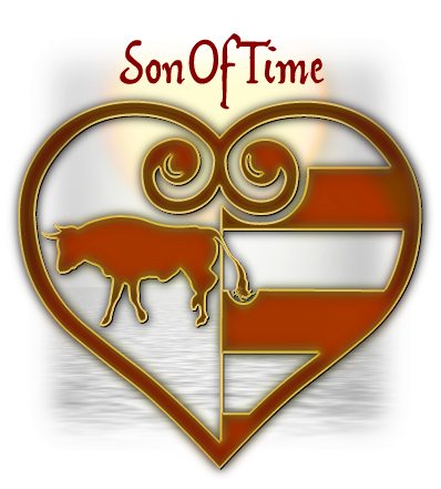
This font is based on the handwriting of Giovanni Borgia/Joan Borja, duke of Gandia, who was the son of a pope and the grandfather of a saint, member of a much-decried family, and founder of a most pious one. Having been sent to Spain, to marry, in 1493, the widow of his deceased brother Pedro Luis Those reports seem to at least partially have been slander. When he was ordered back to Rome, in 1496, Giovanni had already had a son by Maria Enriquez, and she was expecting a second child. However, the one thing he can surely be reproached with, is that he got himself assassinated, in a highly stupid manner ... by doing what he had sworn in his letter that he didn't do, i.e. roam the streets at night, "to go amuse himself". At Rome, no less. Which was a hotbed of Borgia enemies. After he had been missing for some days, his corpse was fished out of the Tiber river, mid-June of 1497, leaving no doubt that he had already been dead when he entered the water. He had been twenty-one at best. Nobody was ever brought to justice for the deed. His father was devastated, his wife never remarried, and entered a convent when their son came of age, and his son carried on in the Spanish dukedom of Gandia, maybe well traumatized by what he had been told about that murder; for nothing short of an angry mob attacking, could induce him to leave his home. Nevertheless, he ended up with about twenty children there, from two subsequent marriages ... among them Saint Francisco Borja. An image of the first page of Giovanni's autograph letter is displayed on the website of the Institut Internacional d'Estudis Borgians, and, considering that Giovanni was seventeen when he wrote it, it struck me as remarkable. His handwriting is never flashy, very matter-of-fact, and rather condensed, but it shows an amazing sense of harmony and proportion. This is certainly not a spoiled brat's hand; in fact, it looks quite mature, and tells at least of a first rate education. Then again, it has been said that Giovanni's mother came from a family of artists Well, after falling in love with Giovanni's ls, at first sight, I made the font. Since the image is rather low resolution, my font is no exact copy of Giovanni's writing, and altogether I decided to keep it as much on the 'modern' side as I could. For example, I didn't go along with the room-taking bows at the the end of his hs, and chose a rarely used y that doesn't look too exotic for 21st century eyes. I thought it didn't matter much, since, anyhow, I had to invent a lot of other stuff. Indeed, my only complaint with Giovanni Borgia is that he was so shy of capitals. Apart from the initial A, I could only find a V, an S, and something that might do as an E (though it isn't one). All the other capitals are made up, as well as the k. I've included my own rendition of the Borgia arms on the micro sign, designed according to what I learnt on the Net, and remembering an image on the cover of a Borgia book by Susanne Schüller-Piroli, where the escutcheon takes the form of a heart. Based on a mistaken etymology, the bull has been the heraldic sign of the Borgia family for centuries. And The font was called SonOfTime as a reference to Josephine Tey's novel The Daughter of Time On the number sign of the SonOfTime font, you'll find the usual long s. The other special characters are
|
top of page |
| Home Xenippa XalTerion EtBoemieRex | FranciscoLucas XiparosLombard Love'sLabour MalaTesta | JaneAusten Xirwena DeiGratia MitreSquare | Tagettes Xiparos _a e i o u Tycho'sElegy | WirWenzlaw XiBeronne Tycho'sRecipe |
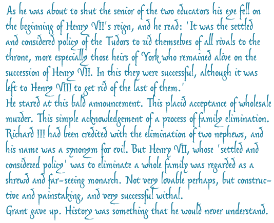
Quote from the last chapter of Josephine Tey's novel The Daughter of Time (first published in 1951).
| Conditions of Use | Contact | Impressum |
| Please complete the address in your mail form with a-frauss.de | ||
| As long as you can put up with an English reply, you may write to me in French, Italian, Portuguese, or Spanish. German mail will be answered in German. | ||
| pd | ||
| top of page | ||